
Create Your Font!
Create Your Font!
Create Your Font! aims to teach students that every typeface they know was at some point designed by someone based on practical, aesthetic, religious, or cultural considerations. Fonts are therefore always influenced by the era in which they were created. The project is also about recognizing important features of typeface design, critically questioning the use of typefaces, and using or further developing them for one’s work.
Description
Every day we are confronted with writings of all kinds and we read, look at, analyze and write text objects ourselves. Be it the place-name sign at the bus stop, the novel’s title on the nightstand, WhatsApp messages from friends, memes and other Internet phenomena, or the pages of a sketchbook: writing is omnipresent in every shape, color, and size.
Advertising shows that typefaces can also have a manipulative effect on the recipients. In the food industry, for example, typographic and design features are specifically tailored to target audience to generate more demand. (Source: Garber LL, Burke RR, Jones JM (2000) “The role of package color in consumer pur-chase consideration and choice.” Working paper, Marketing Science Institute)
But how does typeface work and what are typographic characteristics? By developing their own fonts, the students should gain an insight into the world of typography. It is about first points of contact and quick results.
Tasks and specific work steps
- A1
Create a free account on the web platform calligraphr.com. Here you can upload your self-designed fonts and then digitize them. Over the following four lessons, create at least four different fonts and save them on your laptop. Name them and test each font you created in an A6 size Affinity Publisher document.
- A2
Now develop your own poster, using only letters and no illustrations. Try to use the letters as images that you combine.. Work with black as the main color. You can also use other colors. Use your self-designed Calligraphr font and the first poster design as a basis for this task. Then create sketches and make different designs. Before you create the large format: Draw, paint, print, cut, and collage your ideas on A4, A3, or A2 format. Try out at a whim and try to create several designs at once. When you’re done, create a typo poster on the large-format poster paper. Make use of all the space on the sheet.
Images/Examples
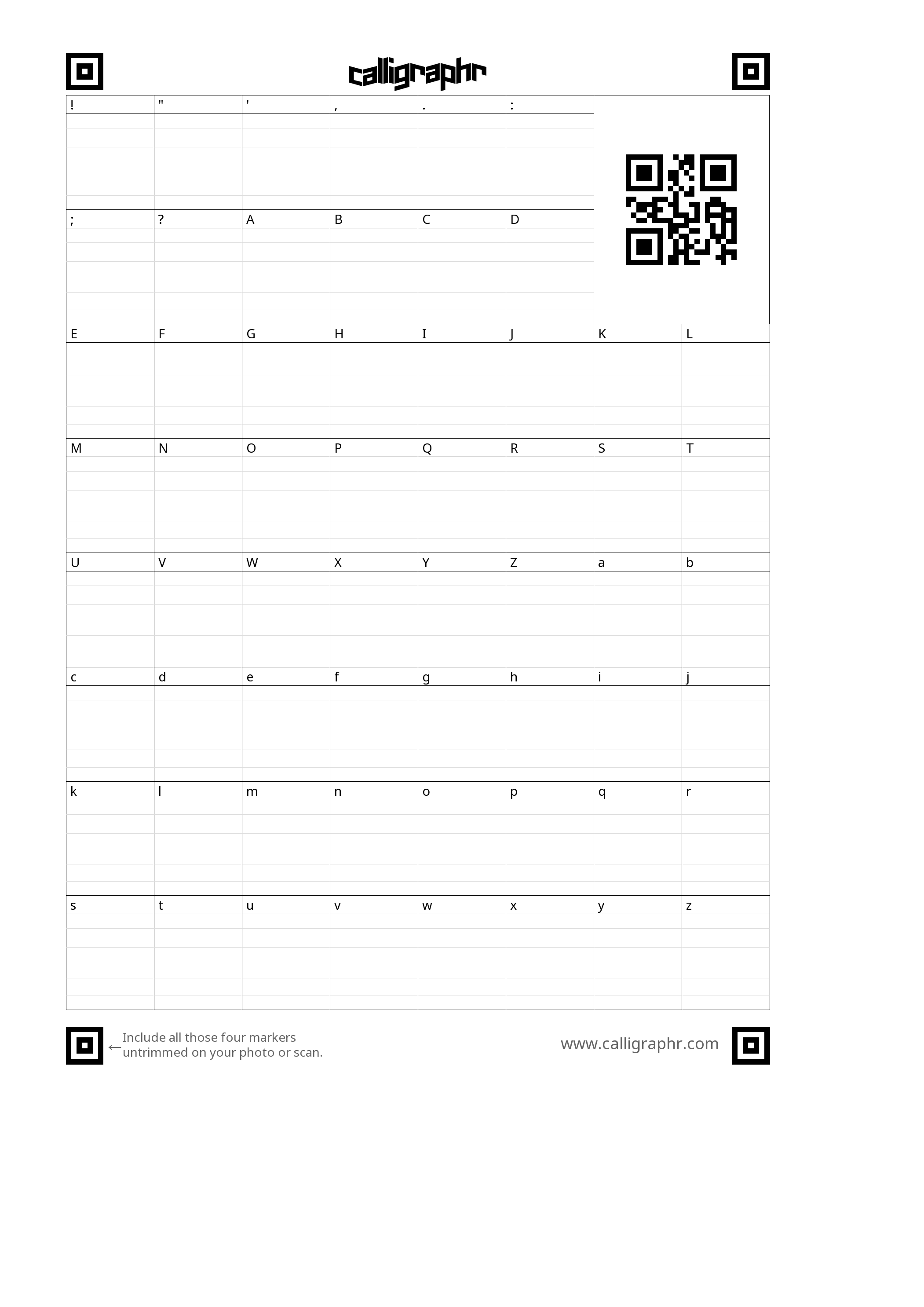
Screenshot Calligraphr Template © 2021 by Italo Fiorentino licenced with CC BY-SA 4.0
Screenshot Calligraphr Template © 2021 by Italo Fiorentino licenced with CC BY-SA 4.0
Screenshot Calligraphr Template © 2021 by Italo Fiorentino licenced with CC BY-SA 4.0
Additional Information
Authors’ Encouragement
Write and design on your own! It’s fun to express yourself in and with writing!
Prior Knowledge and Preparation
Basic technical knowledge of image editing programs and various system interfaces (Mac, Windows, etc.) is required to perform the task. Font images are installed using the respective word processor. Typographic and layout knowledge is also an advantage. For all beginners, I recommend the book “Grundkurs Typografie und Layout” (German) by Claudia Runk.
When teaching young people, responding to their life worlds is advisable, sparking personal interest in the subject matter. To ensure this, I often engage with various Internet phenomena, hang around on news or Internet culture platforms and forums and draw clues for their assignments. From this some examples:
- Example 1: “you will read this first”
“You will read this first” is a dank meme. “Dank meme” is an ironic term for viral insiders who make gags that are intentionally whimsical or have lost their wit to become banal or clichéd. This meme has numerous variations, with different layouts but always the same content. Often found on 9gag.com or reddit.com.
- Example 2: “Graphic Design is my Passion”
“Graphic Design is my Passion” is a meme that draws on the pre-existing collective knowledge of design features of MS Paint. Implied here is a weak understanding of design using the most straightforward design tools.
- Example 3: “we are looking for a graphic designer”
Bad design is good design. The ad above also speaks to a collective understanding of design. In various Internet cultures, MS Paint is considered a maxim for bad design. Used correctly, however, it can also generate positive reactions.
- Example 4:
In addition to memes, there are various references from the graphics and design industry. For example, most students in Switzerland should be unknowingly familiar with the typeface of Adrian Frutiger, a Swiss type designer. The so-called “Frutiger” typeface can be found, among other things, in the logo of the Swiss mobile network company Sunrise and highway signage.
- Example 5:
Katrin Oeding is a multi-award-winning designer and jury member of the largest international creative festivals. She is founder and managing director of the international design agency Studio Oeding in Hamburg. Her poster “What? Money! Money Power Power” offers a minimalist design reminiscent of protest posters.
- Example 6:
Veka Glarus is a venue in Glarus (CH). The poster design shows an interplay of large and small sans-serif letters, accompanied by graphic interventions through gray lines reminiscent of a stack of paper.
Additional Tools
- Microsoft Word
- Adobe InDesign
- Affinity Publisher, https://affinity.serif.com/de/publisher
- Calligraphr, https://www.calligraphr.com